Lab Inventory: User Interface Improvements
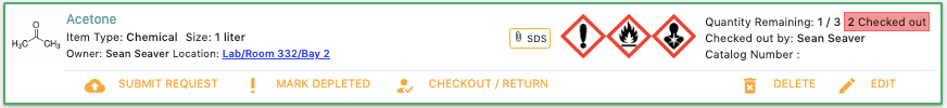
We’re focused on creating great software for researchers. This means reviewing the functions that Lab Spend offers and in this post, we’re highlighting user interface improvements in the lab inventory section. Lab inventory shows items as cards as shown below:

After clicking on item card, it expands showing additional actions: Submit Request, Mark Depleted, Checkout/Return, Delete and Edit
In this post, we will explain our thoughts on improving the item card making it easier for researchers to understand and use.
Updating Quantity:
The quantity field is frequently adjusted used by researchers. If an action happens a lot then we want to keep revisiting it to determine if it can be improved. For editing the quantity, users clicked on the item, Edit then change the quantity once the item modal appeared as shown below:
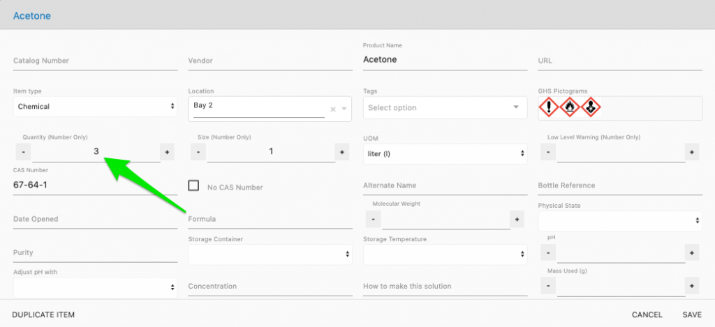
It takes two clicks to be able to adjust the quantity plus time to find the quantity field if you’re a new user. How can we improve this experience?
To improve it, we moved the quantity field to the front of the item card. This eliminates clicks and makes the quantity easily visible, as shown in the image below:

Now researchers can simply use the toggles to quickly adjust the quantity as needed.
Checked Out:
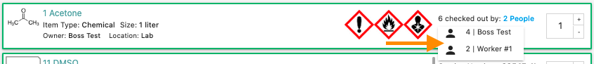
In Lab Spend, you can check out items from the inventory system. Check Out, represents when a researcher has an item in their possession. For example, a researcher may need to use a hotplate at their bench for a day and by checking it out, lab mates would know who to contact and why it isn’t in the location listed in the inventory. The Checked Out feature has been cleaned by removing the ratio shown on the item cards (the 1/3, just left of green arrow below).

The ratio represented how many units were checked out of those available. However, this was causing confusion as researchers thought the ratio was displaying how units were remaining from the initial order. The ratio has now been removed, cleaning up the item card. If multiple people have checked out an item, you can now view their names with a quick hover over as shown below:
Depleted:
Researchers can mark items as Depleted when they run out which is very useful as it keeps all the information that has been entered as compared to the delete option. To mark an item as depleted, you needed to click on the Mark Depleted button shown in the image below:
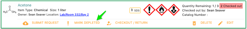
Once clicked, the quantity would update to zero and lines appear on the item indicating that it isn’t in stock. However, a better experience would be for users to adjust the quantity to zero and the item automatically becoming depleted. This improvement allowed us to remove the Mark Depleted button.
Simplifying the user interface makes it more streamlined to use. Researchers have enough to think about but how to use software shouldn’t be one of them. If you’re looking for a free lab inventory solution, feel free to sign up for Lab Spend.